Explained in detail: Colour temperatures of light sources
Posted on Jun 30, 2025

The colour temperature has a major influence on how light affects us. Reason enough to address the topic Light colour of light sources and take a closer look at it.
Light – especially colour temperature – influences how we perceive colours and can even lead to sleep disorders. That is why it is important to consider the colour of lighting depending on how a room is used. We explain how and why.
What does the light colour of a light source mean?
The light colour describes a lamp's colour temperature and is measured in Kelvin (K). Light, and especially light colour, has a significant influence on the effect a room has on people. It also affects well-being, and can affect concentration, sleep and mood. The colour temperature of conventional light sources ranges from warm, yellowish-orange light to neutral, white light and cool, bluish-white light. It is usually specified by the colour temperature of the light source and by the designation warm, neutral or cool. Some packaging also uses colour coding in shades of yellow for warm white light, white for neutral white light and light blue for cool white light. Choosing the right light colour is very important. It should always be based on the intended use and the desired atmosphere. Warm white for relaxation, neutral white for everyday activities and daylight white for concentration and precision in the workplace. Each colour temperature has its advantages and disadvantages.
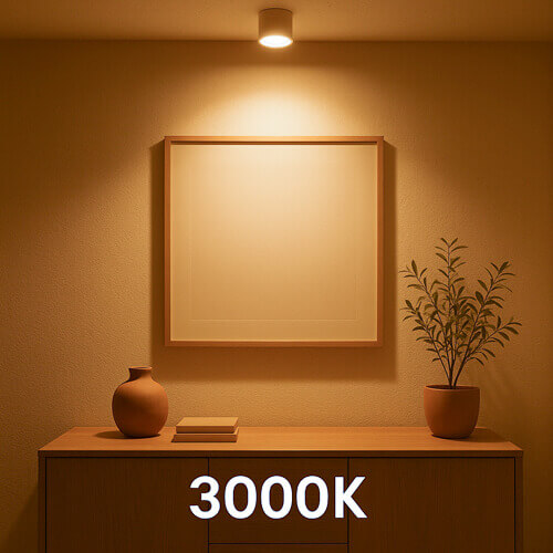
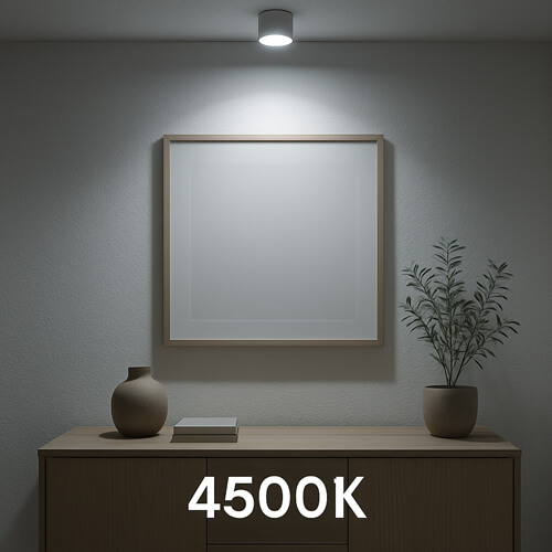

The images to illustrate the effect of different color temperatures are AI-generated .
Warm white light
Warm white light is cosy, calming and similar to candlelight. It most closely resembles the colour temperature of incandescent bulbs, which were very common just a few years ago. The colour temperature ranges from 2,000 Kelvin to 3,300 Kelvin. The lower the colour temperature, the more orange the light appears, until it turns red as the temperature continues to drop. The yellowish light creates a very cosy atmosphere and has a calming effect. This makes it popular wherever a relaxed, feel-good atmosphere is desired. It is ideal for private living spaces, bedrooms or terraces. In commercial settings, warm white light is mainly used in restaurants and bars, as well as in hotel lobbies, to make visitors feel comfortable. Warm white light has the advantage of being significantly less dazzling than lights with a higher colour temperature, but it also has the disadvantage that the yellowish light distorts colour rendering. Warm white light does not interfere with the natural release of melatonin and contributes to improved sleep quality. This can be significantly enhanced with dimmable LED spotlights by reducing the brightness. What is advantageous in the evening on the sofa and terrace is the opposite in the workplace, as warm white light can be very tiring during prolonged work requiring concentration and reduce performance.
Neutral white light
Neutral white light is light with a colour temperature between 3,300 Kelvin – which is almost warm white – and 5,300 Kelvin – which is relatively cold light. LEDs are typical neutral white light sources, with 4,500 Kelvin they are fairly central in the spectrum. The advantage is a neutral light colour that ensures very good colour rendering and can therefore be defined as functional and clear light. As the colour temperature increases, the ability to pay attention and concentrate is enhanced. Neutral white lighting is therefore ideal for kitchens, stairwells or for applying make-up in the bathroom. It is for rooms where people spend relatively little time. It is less appropriate for living rooms and bedrooms. Neutral light is also typical in offices and classrooms. After all, these are places where people need to concentrate on their work.
Cold white light
As the name suggests, cool white light can appear cold and uninviting, making it completely unsuitable for areas where relaxation and recreation are the focus. With a colour temperature of more than 5,300 Kelvin, it comes closest to daylight. Typical values for light sources are between 6,000 Kelvin and 6,500 Kelvin, which can have a positive effect on concentration, especially when there is little daylight. It is ideal for work areas where attention to detail is important, such as medical practices, laboratories or the industry. However, the bluish light is also beneficial in workshops and production halls of craft businesses, where precise work is also desirable. Excessive exposure to blue light, especially before bedtime, can cause restless, unrefreshing sleep. Cold white light should therefore be avoided in living spaces, especially in bedrooms.
Typical colour temperatures and their effects
- Warm white (2.000–3.300K) has a cosy and relaxing effect
- Neutral white (3.300–5.300K)) appears clear and functional with good colour rendering
- Daylight white (5.300–6.500K) has an activating effect, improves focus and keeps you alert
There are, of course, various special light colours in the visible light spectrum, but these are not relevant in terms of conventional lighting. These include for example red light, which is mostly used for therapeutic purposes. Ultraviolet light, better known as black light, is mainly used for black light effects with neon colours or for authenticity checks on banknotes. Coloured light in the form of single-colour light sources or mixed LEDs (RGW or RGBW), which can be used to create atmospheric colour changes, are also special light colours that are very popular for specific applications or in the smart home sector, but are not generally used for lighting living spaces and workplaces.
The perception of colours and colour contrasts can change regardless of the colour rendering index CRI due to the colour of the light, making them appear warmer and darker or cooler and brighter. Depending on the specific colour temperature, it is even possible that certain colours are completely absorbed by the light and thus appear almost colourless or black. However, we will address this topic separately together with the CRI.
We hope that this blog post has shed some light – whether warm or cold – on the topic of colour temperatures and their effects. As always, if you have any questions, please feel free to send us an email. We are always happy to receive feedback or have you share this post, as each and every text is a lot of work, but it is work that we are passionate about.
If you want to stay up to date, find out what is on our minds and what is happening in our online shop, follow us on Instagram und FacebookWe appreciate every like.
Your SaschafromS-Polytec