Explained in detail: The colour rendering index of light sources
Posted on Jul 7, 2025
The colour rendering index of light sources indicates to what extent colours are distorted. We explain what the CRI is.
How colours appear under light depends greatly on the CRI. A low value distorts colours and impairs the sense of space. That is why good colour rendering is crucial depending on the room and its use. We explain what is important when it comes to CRI and how to make the right choice!
What does the colour rendering index mean for a light source?
The colour rendering index (CRI) is a measure of how natural colours appear under a specific light source compared to a reference light source. Essentially, it is a parameter for evaluating artificial light sources, particularly with regard to colour perception by the human eye. Put simply, the CRI indicates how well a light source, such as an LED spotlight, reproduces colours as we would perceive them under sunlight – in other words, as we are accustomed to seeing them.
What exactly is CRI?
The colour rendering index (CRI) is an internationally standardised parameter that indicates how natural colours appear under an artificial light source. The CRI was developed in the 1960s by the CIE (Commission Internationale de l’Éclairage), the International Commission on Illumination. The aim was to create an objective evaluation method for comparing the colour rendering quality of different light sources. The background to its introduction was the increasing use of fluorescent lamps and other artificial light sources, which differed significantly in terms of their colour rendering. While the light from an incandescent lamp reproduces colours relatively faithfully, other light sources sometimes showed strong colour distortions – such as a pale red or an unnatural skin tone. The CRI was developed to make these differences measurable and comparable. Thanks to its informative value, the CRI has become the global standard for evaluating light sources – both for professional use and for everyday life.
How is CRI measured?
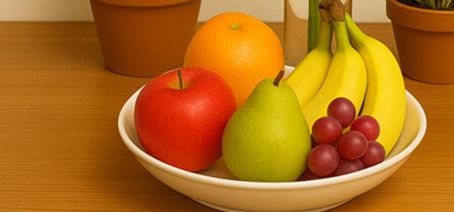
The CRI is measured in a laboratory using a standardised procedure. A test light source – for example, an LED lamp – is compared with a very special reference light. This reference is usually daylight or, for warm white light colours with a colour temperature below 3,300 Kelvin, the light from a conventional incandescent lamp. A series of eight standardised colour fields containing typical everyday colours, such as bright blue, pink, orange or olive green, are then illuminated one after the other with both light sources. The difference in appearance of these eight colours under the test light source is compared with the reference light source. The smaller the difference, the better the colour perception when illuminated with the tested light source. The CRI value is then correspondingly higher. The highest possible CRI is 100, which means that the colours appear exactly the same under the light source as they do under natural light.
Example: For different colour rendering: A red T-shirt may appear bright and rich under bathroom lighting, but suddenly appear much paler or slightly brownish in daylight. This indicates poor colour rendering and therefore a low CRI. If, on the other hand, this T-shirt looks just as red in the bathroom as it does when you go for a walk outside, this is an indication of good colour rendering – i.e. a high CRI.
Standardised test colours are used to measure the colour rendering index (CRI). These are clearly defined in the international standard CIE 13.3-1995. There are a total of eight reference colours (TCS01 to TCS08) that are used to determine the general CRI (Ra). For a more detailed evaluation, additional colours (TCS09 to TCS14) can be used, but this is usually only done for light sources that are used in specific environments where very high colour fidelity is important, such as in laboratories.
Standardised reference colours for CRI measurement
- TCS01 (R1) Light grey-blue (slightly bluish grey)
- TCS02 (R2) Yellow-grey (light beige-yellow)
- TCS03 (R3) Dark complexion (skin tone, slightly reddish)
- TCS04 (R4) Saturated pink (intense old rose)
- TCS05 (R5) Yellow-green (pale olive green)
- TCS06 (R6) Light blue (bright light blue)
- TCS07 (R7) Violet (medium purple)
- TCS08 (R8) Light pink (rosé, flesh-coloured)
- TCS09 (R9) Saturated red (intense blood red)
- TCS10 (R10) Saturated yellow (pure lemon yellow)
- TCS11 (R11) Saturated green (pure grass green)
- TCS12 (R12) Saturated blue (intense royal blue)
- TCS13 (R13) Facial complexion, light (lighter skin tone)
- TCS14 (R14) Facial complexion, dark (dark skin tone)
- CRI 90 - 100 Excellent, very lifelike
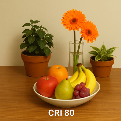
- CRI 80 - 89 Sufficient, colours appear realistic
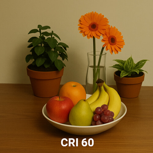
- CRI 60 - 79 Mediocre, colours slightly distorted
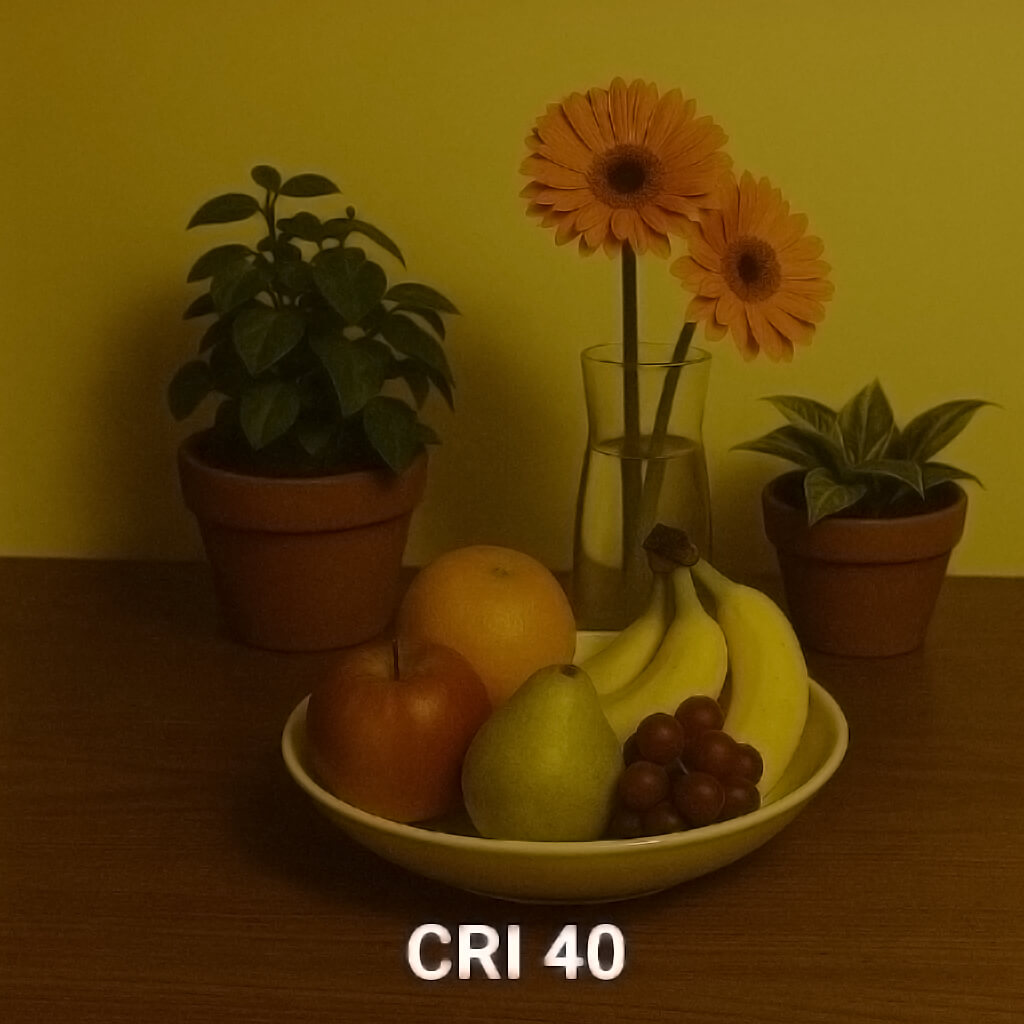
- CRI 40 - 59 Poor, significant colour distortion
- CRI < 40 Very poor
Extended reference colours for CRI measurement
What is a good CRI for light bulbs?
A good CRI for light sources is crucial for how natural and pleasant colours appear in everyday life. Especially in indoor spaces where a lot of artificial light is used, colour rendering significantly influences the perception of people, objects and materials. A CRI of over 90 is considered high and indicates very good colour rendering. Such light sources show colours almost exactly as they appear in natural daylight. This is advantageous in living spaces, for example, where wall colours, furniture or clothing should look the same indoors as they do outdoors. A high CRI is also important in areas such as art, photography, fashion and retail, where colours must be reproduced realistically and without distortion. Light sources with a CRI between 80 and 89 also offer good quality, which is perfectly adequate for most everyday applications, such as patio lighting, kitchens, offices or corridors. Colours usually appear correct at these values, even if subtle differences are less precise. For example, a green apple still looks green under such light, but may appear slightly duller than in daylight. CRI values below 80 can cause colours to appear distorted – for example, red may appear brownish, or skin tones may appear pale or greyish. In warehouses, basements or technical areas where colour is of secondary importance, a lower CRI may be sufficient, but for living and working areas, the highest possible value is recommended.
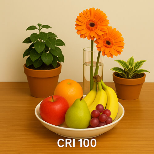
The images illustrating the effect of different CRI values are AI-generated.
Typical CRI values and their meaning
NOTE: The CRI does not say anything about the colour temperature (e.g. warm white vs. cool white), but only about the accuracy of colour reproduction. In fact, colour temperature also has an effect on colour perception, as colours are absorbed to a greater or lesser extent depending on the colour of the light.
We hope this blog post has brought some colour into your life. Or at least made it understandable why clothes always look so much better in the shop than they do at home. If that's the case, you should consider changing your lighting. As always, if you have any questions, just drop us an email. We are always happy to receive feedback or have you share the post, because every single text is a lot of work, but we are passionate about what we do.
If you want to stay up to date, find out what's on our minds and what's happening in our online shop, follow us on Instagram and Facebook. We appreciate every like.
Yours Sascha from S-Polytec